My designs are always different for personal things, too. I'm on my own time-line and have a lot of freedom in what I'm working on. This makes me feel as though I've got more time to think it through and come up with a good idea, because I don't need anything to show for the time I'm just mulling it over. The other huge thing is, I don't have to force myself to work- I can think for days and then design when a good idea hits me. It's why I've always preferred to have multiple projects at work. I can work on one thing 'til I hit a block, then work on another that I've thought of a good idea for.
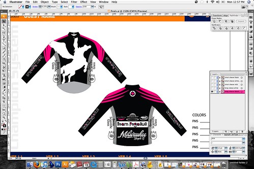
But enough yammering and more pictures, right? Here's a shot of what the jerseys will probably look like. The pink 'wings' on the back took over four hours for me to arrive at. I knew I wanted a pink shape on the shoulders to make our riders easy to spot from afar and in a crowd. I needed a shape that was simple, fast, strong (but not too clunky!) and sharp, but not so sharp that it looked delicate or too feminine. I wanted it to look good from the back- and also 'fast' from the side and 3/4 view while on a bike, where most photos are taken. Here's what I've got so far:

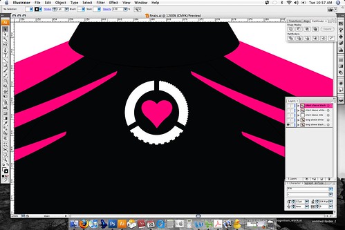
Not too shabby, right? I'm pretty pleased with how it's coming along. The thing I'm really pumped about is the heart in the middle of the back:

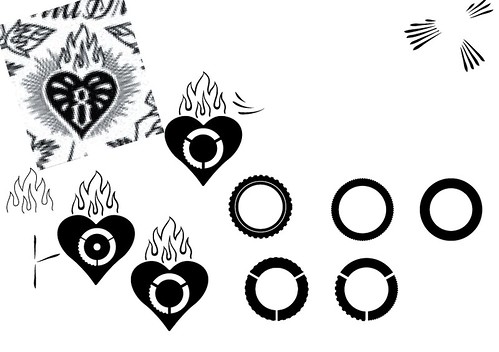
I forget how the idea came about, but in a flash of brilliance, I saw three treads forming a logo of sorts. It would be broken into three parts to represent the disciplines in which Pegasus races. There would be a section with slick tire (for road/track/TT), file tread for CX and knobbies for mountain biking. Then the muffling lint settled on my brain once more, and I felt that it needed a little jazzing up.
I got an idea from a Mike Giant piece (the pixel-y bugger in the upper left in the photo below is a close crop) and went from there. I've been checking out Giant lately, and just itching for a chance to use an idea from his work, which is suited to vector work. I've always loved the Mexican sugar skull art (that he sometimes features), too. But I digress. Originally I liked the idea of the flames, but didn't really nail them, and felt it would be too busy with them, anyway. Then I played with the wheels- creating the different treads and deciding just how thick carbon deep section rims would be. I experimented with hubs as well as some other things, but ultimately wound up leaving them blank.
As you can see, I had thought the wheel would go inside of the heart right up until the end when I placed it on the design on the jersey and thought the wheel made the thing look too intricate. Bringing the wheel to the outside worked so much better. It took me a while to think of it, but at least I did eventually!

And with that we have one of the cleverest things I think I've done in a long time. I'm trying to get back to simplicity in my design work. Often times I start thinking too grandly... I want to come up with something so cool and so different that, well, I just pull myself in too many directions and can't come up with a strong design. Simple is strong, and I think I'm getting better at it. Practice makes perfect, right? The work I do for my job is helping me grow as well, and I look forward to doing better work in my professional life, too. I feel like I'm getting better and faster at what I do, which is a great feeling after a bout of designer's block!

3 comments:
very nice stuff.
as the schmuck that designs the LGR kits i know excatly what you mean... its a weird sort of pressure hoping to please everyone, and its pretty sweet seeing the kits in action when you are done!
see you suckers at stuporbowl.
That little logo with the tires and the heart inside is fantastic. I'm a graphic designer as well and have been working on more bike-related projects lately... and to see something that refreshing (without just a chainring or a wheel, etc.) is nice. Thanks for that. The kits look great as well!
ps. I'm Jon (adhere from chifg). I found your blog from Jeff Kao's from Ira Totally Sweet. Good stuff!
Post a Comment